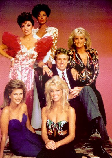
Plum is such a rich color, isn't it? It can be a little Dynasty when done wrong, but I like the modern take on these goodies with the frayed edges. The necklace reminds me of a crocus. The shoes would look fab with a suit, worn at a Junior League committee meeting ... or equally chic with dark jeans and a black cbgb tshirt. And guess what ... you can have both for under $55.
Showing posts with label purple. Show all posts
Showing posts with label purple. Show all posts
Wednesday, March 11, 2009


Monday, February 2, 2009
inspiration: neighborhood flowers

Sometimes inspiration is in your own backyard. I took these photos in my neighborhood last week. The hot pink, lilac, violet and mimosa will show up in the upcoming delphine collection of floral letterpress note cards.
Friday, January 23, 2009
client we heart: here comes the bride


Yesterday afternoon I visited Here Comes The Bride in their new location (Mission Valley, right near downtown San Diego, California). I love the new store! They went with a lilac and deep plum theme for the décor, to match the new logo and business cards we designed for them. So pretty! I also spotted, among the sea of white and ivory gowns, a pretty blue wedding gown. What do you think about blue for a bridal gown?
Tuesday, January 13, 2009
trend: violet

creme de violette -- violet liqueur
Discovered this holiday season: Créme de Violette Violet Liqueur. Delicious straight up or in a chilly vodka martini. Almost too good to be true! I also like this wildflower wine made by J. Lohr, which tastes of violets. Violet is a pretty every day/regular flavor in France; when I was a kid my favorite gum flavors were violet, cassis, and licorice -- none of which I have ever seen in the US. Why are there no violet candies in the US, yet we're plagued with a plethora of disgusting watermelon flavored candies? I'm just sayin...
Friday, January 9, 2009
logo design: here comes the bride


Here Comes The Bride celebrated their move to a new location by changing their logo colors from earthy green to their new favorite color: violet. So chic and lovely, yes? Normally I would say that changing your branded logo colors is a big mistake, but in this case I think the new color is more representative of the whole bridal vibe and was the best choice for them.
Friday, November 7, 2008
vintage: floral wallpaper

Sometimes, when I'm feeling especially creatively challenged, I check out vintage wallpaper patterns for a little inspiration. I like the unexpected color combo here: olive, puce, pale seafoam, and eggplant.

Thursday, October 30, 2008
new from charleston collection: sullivan


sullivan design, new from delphine's charleston collection
"Sullivan," one of the new designs from our upcoming Charleston Collection, is named after Sullivan's Island, the "next door island" to where I grew up (Isle of Palms, South Carolina). I chose the deep marine blue ink because it reminds me of summer nights on the island, and the bright crocus ink is a nod to my mom's favorite color circa 1983!
Thursday, June 19, 2008
purple


Purple used to be my least favorite color, so I used my sketchbook to "work through it" and learn to like it. One purple thing I do love: Jacaranda trees.
Subscribe to:
Posts (Atom)

 Posts
Posts