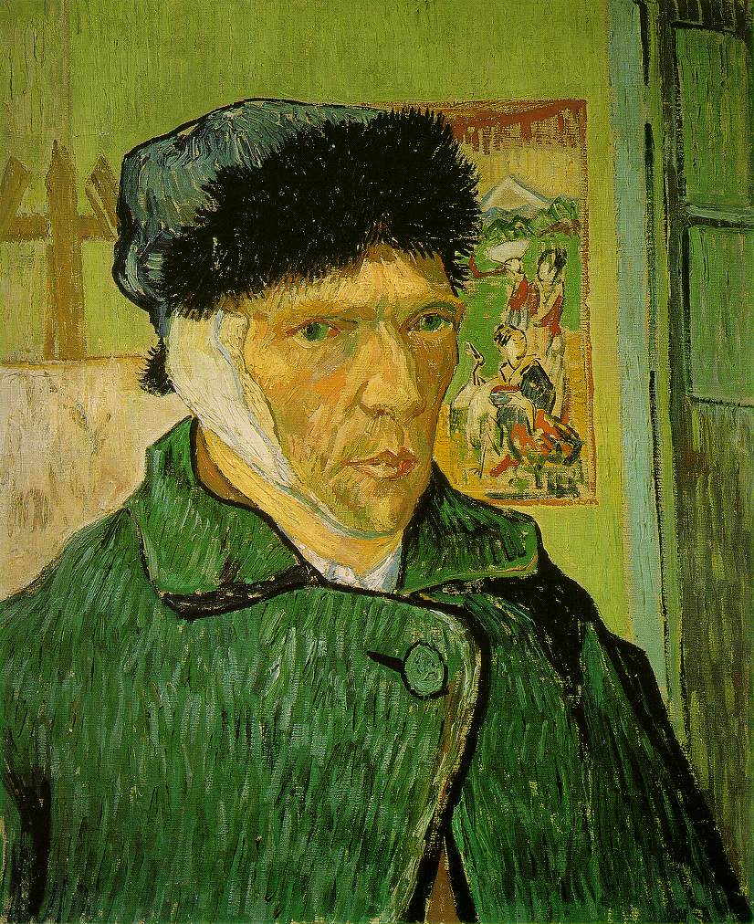
These colors make me happy.
Showing posts with label inspiration. Show all posts
Showing posts with label inspiration. Show all posts
Friday, March 13, 2009


Friday, March 6, 2009

Wednesday, February 4, 2009
public art and press room visit

Last week John and I had a chance to visit with the super fabulous Cardstore.com peeps in Emeryville, California, and get a tour of their facilities. We loved seeing their press rooms, their fulfillment/shipping center, and their fun loft-like workspace. The press rooms were pretty quiet (we visited in late afternoon), but we were told that all the presses run nearly 24 hours a day around the holidays in order to keep up with all their orders! We were also beyond thrilled to find out that one of our holiday photo cards was one of their top sellers this holiday season.
One of the greatest moments of the tour was seeing their Heidelberg press, which they have converted into a die-cutting machine. It was completely surrounded by bright yellow safety bars. Our tour guide seemed wary of the machine and gasped when we told him that delphine uses the same type of machine to letterpress (only without all the safety modifications)! Many thanks to Matt and all the peeps at Cardstore for the fun tour!
One of the greatest moments of the tour was seeing their Heidelberg press, which they have converted into a die-cutting machine. It was completely surrounded by bright yellow safety bars. Our tour guide seemed wary of the machine and gasped when we told him that delphine uses the same type of machine to letterpress (only without all the safety modifications)! Many thanks to Matt and all the peeps at Cardstore for the fun tour!
Tuesday, February 3, 2009

Monday, February 2, 2009
inspiration: neighborhood flowers

Sometimes inspiration is in your own backyard. I took these photos in my neighborhood last week. The hot pink, lilac, violet and mimosa will show up in the upcoming delphine collection of floral letterpress note cards.
Thursday, January 22, 2009
inspiration: factory orange and yellow

 A recent visit to my dad's factory (top images) inspired the factory orange and steel grey color scheme for a project I'm working on now for Strathmore (bottom images). When I was a kid I loved visiting my dad at his factories and walking the floor with him. I inherited an appreciation for mechanical equipment, which, I think, is the reason I was drawn to the craft of letterpress.
Wednesday, January 21, 2009
inspiration: california
 california wild flowers
I'm so excited the mimosa trees are just starting to bloom. They are my favorite Southern California tree. I'll take photos and post next week. FYI, the mimosa is a huge inspiration to me ... I have a wedding suite designed after it, as well as a lovely sympathy card. It's also my mother's favorite bloom, because it reminds her of her home town in the South of France.
Wednesday, November 12, 2008


Friday, November 7, 2008
vintage: floral wallpaper

Sometimes, when I'm feeling especially creatively challenged, I check out vintage wallpaper patterns for a little inspiration. I like the unexpected color combo here: olive, puce, pale seafoam, and eggplant.

Thursday, November 6, 2008
holiday ornament swap

I just signed up for the 3rd Annual Holiday Ornament Swap hosted by cake & pie and freshlyblended. For all the details please check out either of their blogs. Deadline to signup is November 10th. I can't wait to start making my ornaments!
Wednesday, November 5, 2008


Tuesday, November 4, 2008
fun stripes

Paul Smith (notebook and coffee pot) is the master of stripes, but I also love these Jonathan Adler pillows! The sparkly dress by Banana Republic is in last year's Pantone Color of the Year, Blue Iris. I think you'll see this color sneaking into home décor next year. Necklace from Banana Republic; chic chartreuse lamp from Moss.
today ...
 Today I get the true pleasure of watching two new citizens (my mom, Beatrice and my grandmother, Delphine) vote in their first US presidential election!
Monday, November 3, 2008
polling place photo project

I received a reminder email from AIGA, the professional association for design, this morning about the NYT Polling Place Photo Project. Take your camera to the polls tomorrow and help document the election.
Every state has diferent election laws, some which allow photos of polling stations and others that do not, so check your states' procedures to find out what is acceptable.
Every state has diferent election laws, some which allow photos of polling stations and others that do not, so check your states' procedures to find out what is acceptable.
Friday, October 31, 2008
having one of those days, too?

I'm having one of those days ... trying to balance work, more work, even more work, life ... and halloween costumes.
Monday, October 27, 2008
inspiration: trees


My friend L sent me a pic she took earlier in the month of fall Aspen trees in Colorado. They remind me of Brian's gorgeous work over at Old School Stationers. Here in Southern California the trees don't really change colors much ... it's still in the 80's at our house. While I love the "perfect" weather here, sometimes I do miss a good rainstorm and a crisp October afternoon!
Friday, October 24, 2008
what i'm missing

I think this is what my jewelry box is missing! Yum. Wish I could scoop up this pink gold, chrysoprasne and rock crystal "Capri" collection by Pomellato.
Wednesday, October 22, 2008


Tuesday, October 21, 2008
trend: crackle metallic


Trend I'm loving: aged, crackled, and colored metallic, like these cool ballet flats from J.Crew.
"Soul of the Underground," by Jean Dubuffet, is an oil painting over aluminum foil. I stood in front of it for a looooong time. Hard to tell from this pic, but it's 3-dimensional and totally mesmerizing!
Monday, October 20, 2008
van gogh & the colors of the night

I had the great pleasure over the weekend to visit MOMA in NYC and was lucky to snag a ticket to see the Van Gogh exhibit: Van Gogh and the Colors of the Night. I had seen some of the paintings (from the MOMA's permanent collection and at Musée D'Orsay in Paris) but never before had I seen so many Van Gogh works in one place. Walking through the exhibit felt like walking through one of his paintings--it seemed like all the walls were painted colors taken directly from Van Gogh's color palette.
What I found most remarkable was that all day I had been walking around the museum and had been confronted with sadness, loneliness and pain. So many pieces at MOMA are depressing! (Or maybe that's just me projecting???). BUT, I found Van Gogh's paintings quite the opposite. Here's a man who is known to have had serious psychological problems (he did cut off his own ear and all), and most of his paintings depict evening/night scenes, yet I found his paintings to be the most joyful in the entire museum: a celebration of life.
I highly recommend visiting MOMA's online exhibit (and of course the real one if you're in NYC)--the audio clips are great.
The painting shown above, "The Sower," is much (much!) brighter in real life. The setting sun is super bright lemon yellow and the green sky seems electrified. Loved it!
What I found most remarkable was that all day I had been walking around the museum and had been confronted with sadness, loneliness and pain. So many pieces at MOMA are depressing! (Or maybe that's just me projecting???). BUT, I found Van Gogh's paintings quite the opposite. Here's a man who is known to have had serious psychological problems (he did cut off his own ear and all), and most of his paintings depict evening/night scenes, yet I found his paintings to be the most joyful in the entire museum: a celebration of life.
I highly recommend visiting MOMA's online exhibit (and of course the real one if you're in NYC)--the audio clips are great.
The painting shown above, "The Sower," is much (much!) brighter in real life. The setting sun is super bright lemon yellow and the green sky seems electrified. Loved it!
Subscribe to:
Posts (Atom)

 Posts